Friday 30 November 2012

Selective processing and prominence

This exercise is concerned with the use of post processing to make a figure less prominent in an image already used for an earlier project.

I have written in the learning log that I view post processing very much as part of one's photography. It does not assist with choice of subject and only to limited degree with some technical issues, notably depth of field and focussing, but post processing can do much to alter the balance of light, colour and contrast within an image, all of which alter the balance.

I selected an image used for the exercise Making figures anonymous. Rather than simply altering the exposure or contrast, I used the quick selection tool within CS5 to select the woman's coat and scarf, and then used the hue and saturation tool to alter the colour of each to a duller shade:


The woman is slightly less prominent in the second image (in fact this conversion would have worked better in the context of the earlier exercise) as a result of using a colours that blend more with the background for her coat and scarf. Interestingly, the hue of the sky has changed slightly too.This seems to be a result of the upload as is not evident in the original images.

As an alternative, or in addition, the woman could be made smaller within the image using the free transform tool. This technique works in some circumstances where the background that is then left white can satisfactorily filled. This was not one of those circumstances.

The techniques to alter the balance of a photograph using post processing are familiar to me. This is a useful exercise to demonstrate one of the techniques for the particular circumstances here.

Balancing figure and space

The aim of this exercise is to use two images demonstrating a difference in balance between the people and the setting.

An ideal location for this exercise was the New York subway. From the same seat I took the following images:


The individual on the right of the first image is more central in the second.

The first image is much more about the sense of place in respect of emptiness - the reflection in the window shows no people on the opposite side of the carriage. It has a late night feel, enhanced by the passenger having no bags.

In the second. we still get the impression of an off peak service (the litter adds to the impression) but we have more passengers. The focus of the image is the lack of engagement between passengers, even those close to the camera who we may assume are known to one another.

So the balance of the image - the different perspective - has resulted in images that demonstrate an alternative slant; each image demonstrates a slightly different message, albeit within the same sub text of a partially empty subway carriage.

Often during this and previous course, I have worked on exercises that demonstrate in an analytical way what one instinctively knows. This is such an exercise; at one level it is obvious that the message for any image is unique and one takes that for granted. But this exercise demonstrates that concept by using a fairly subtle difference - using the same picture situation to take images with a different balance of people and place to demonstrate a different message.


Thursday 29 November 2012

British Journal of Photography November 2012

The main feature of BJP in November is a review  of entries for the Taylor Wessing Photographic Portrait Prize. The article was written pre announcement of winners but, using the iPad version, I was able to review the winning entries.

This is clearly a very relevant feature for this course, and I was interested to see how some of the lessons and  tips that have picked up in the last few months might be seen in these competition winners.

First prize went Jordi Ruiz Cirera for his portrait of a Bolivian woman, Margarita Teichroeb, from the Mennonite community:


This is a fine photograph of an unwilling subject (photography being forbidden for Mennonites) with an awkward expression. The image evokes sympathy with both the subject and the photographer. Technically, the use of backlight works well and there is evidently a wide aperture used, such that the other two women feature only out of focus.

The image reminds me of Lange's famous portrait Migrant Mother:


The use of the hand to the face is similar, and there is evidently something troubling both women, albeit a matter of self consciousness in Cirera's image, as opposed to one of circumstance in Lange's.

The second prize went to Jennifer Pattison for a portrait of her friend, Lynne:


This is a complete contrast to the first image: a completely nonchalant confident subject taken as part of a series by Pattison exploring "the brief moments where a subject loses self-consciousness of their naked body". The pale skin of the subject is set off well by the dark green wallpaper.

The mug is a critical prop in this image; it emphasises the comfort of the subject in her nakedness and adds a sort of homeliness and security to the image that sits in contrast to the winning entry. It is bold, and it works.

I am much less convinced  by the third prize winner:


This image is of Mark Rylance, and actor with "such an interesting face" according to photographer Spencer Murphy. Interestingly  Murphy says "I've always enjoyed working with actors as there is no awkwardness or discomfort in front of the camera". There is subtext to this: they are easy subjects, and consequently one feels the photographer needs to work harder then Murphy has with this rather flat image. Frankly, I am surprised that this image featured as a winner; it offers little in terms of originality of subject or technical expertise.

The fourth portrait winner is The Ventriloquist  by Alma Haser:


Haser notice the subjects, James Agazzi Brooks and Luke Casey, at a party and wanted immediately to photograph them just because of their looks and haircuts.

There is a Marmite feel to this image: love it or hate it. I think I just about love it because it is an opportunistic image.It is good to hear the honesty of a photographer who just saw the image when she first noticed the subjects, and kept this image as a standalone rather than using as part of a project. There is a tendency on this course to seek context and narrative - it is good to remind onesself that sometimes a photograph can be a good standalone piece of work.

Of other shortlisted images, my favourite is One Summer in London by Phoebe Theodora.Found it impossible to get a downloadable version of this image of a naked woman huddled against a wall. Her expression is sad, frightened almost, and vacant, almost as if she has been defiled, a thought evoked by her legs being tightly together. It is a powerful and evocative shot.


Sunday 25 November 2012

Making figures anonymous

The object of this exercise is to take images where the place is the principal subject, but the image is enhanced by the addition of person(s). For this to work, the person(s) must not be prominent in the image.

We have already come across this concept in the previous two exercises: a single figure small by definition emphasises the place ahead of the person, and in busy traffic, we are concerned with the sense of many people going about their business rather than them as individuals within the setting. The four images used for the previous two exercises could easily be used in this one.

The notes suggest two to four images to be selected. I chose five, as each offered a different perspective on the anonymity.


St Michael's Mount in Cornwall is a famous landmark in Cornwall. The aim of the image was to emphasise the defences of the castle. The people add at least three dimensions to the image:
  • colour and a sense of purpose about the place;
  • a sense of scale next to the battlements;
  • a sense of perspective in the vertical plane - the figures on the lower level are much smaller in the image then the two closest

This is a slightly different use of the concept of silhouette. Taken with a smartphone in the Brecon Beacons, the slightly stooping figure appearing from the mist adds to the sense of gloom and drabness.


Here the principal subject is the view of the Scottish islands with a yacht in the middle ground and the darkening sky. The figure on the left is clearly taking it all in.


In this image we have a partially obscured person at the foot of the stairs. The principal aim of the image is to focus on the light falling on the stairs and on the landing; adding an indistinguishable person to the image adds some interest and scale and avoids the image looking too clinical; being semi obscured to the right of the image we can see the two spotlights on the landing clearly.


In this image of  Medieval Art at Cloisters museum in northern Manhattan, I use the concept of shooting from behind people to add interest to what would otherwise be a rather flat image of an alabaster sculpture with a fresco above. The people emphasise the building's purpose as a museum. Both are looking upwards so there is a strong implied line towards the painting. The light falling from the right helps to add some form to the image.

This exercise helped me think more analytically about the relationship of place and people in the cases where one's principal aim is to photograph the place, but the addition of people can help emphasise the purpose of the place, and add scale and form to what might otherwise be an uninteresting image.

Thursday 22 November 2012

Busy traffic

When in New York,  took the opportunity to visit Grand Central Station with the express purpose of taking inages for this exercise.

I chose two viewpoints on the balcony: one taking the image from the end, the other sideways on.


The first image was taken ot 0.5 sec shutter speed, deliberately to emphasise the movement.

The second image was taken using 1/20 shutter speed. This image, by virtue of the faster shutter speed and a slightly higher elevation, demonstrates well the randomness of people's movement across the concourse.

This exercise was enjoyable to do - I had a preconception of what would work before going to Grand Central Station. The busyness of the station is emphasised firstly by the motion blur, and secondly by using a wider composition. Despite the motion blur, the first image works less well due to looking along the concourse; the concept is better demonstrated in the wider and flatter second image where the randomness of the movement is more evident.


Sunday 18 November 2012

Feedback from Assignment 3

Received feedback on day returned from New York.

Plaesed that turot notes "commitment to the course" - it has been less easy now working four days per week and with marathon training (very disappointing that New York marathon was cancelled after all the preparation) but determined to maintain some momentum on the course.

Subject wise, tutor has noted the variety induced by choosing public places and places of work.

Kiev metro

Tutor likes the grainy black and white as emphasising the lack of modernization.
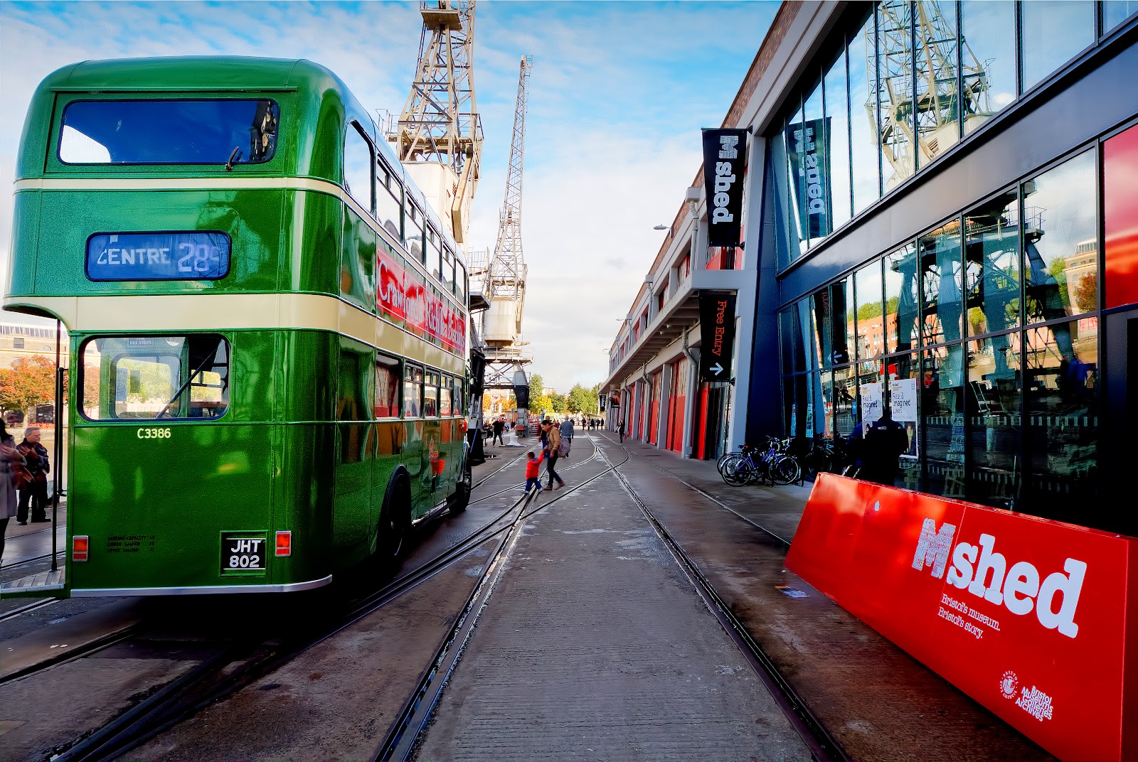
M Shed Bristol

More bright and cheerful, befitting a leisure attraction. Tutor comments that bus picture is very bright, noting that may be caused by composite image. This is true to a degree, as I selected the image from Photomatix that provided the richest colours, but alternatives were available. I take the point that perhaps the brightness of the green and red take the eye left and right. Here is the image less saturated compared to the original below:


Perhaps works better less saturated - not sure myself, rather prefer the richness of the original.

Silhouetted picture "works very well"; I thought this was the best shot of the portfolio, and actually one of the best I have taken for OCA work. I shall enter this in competitions. The composition is perfect with the people on the left, and the Matthew on the right.

Balloon is "very bright and busy"; the annual balloon festival in Bristol is indeed a bright and busy occasion, and tried to reflect that in the image.

Edge Equipment Hire, Runcorn

Images "work really well to demonstrate a functional place set out for purpose".  Again, pleased that the message trying to convey is being understood. Tutor looking for more clarity on the shot. Am I working with cable release or remote? No, not on these although do use remote sometimes.

The City Academy, Bristol

 Tutor queries sharpness of first shot and whether file size is issue. Answer, no, always shoot in RAW and convert to medium size jpeg for web. It may be a function of web.

Tutor likes library image but is "less keen on the the third image with students partially hidden behind over-hanign lights". Agree with that; I am usually meticulous with taking and choosing images with sound composition but actually did not take heed of the blocking nature of the lights in this case. It was a mistake.

Bonawe Iron Furnace

 Tutor prefers the second, non compositional, shot as "clearer, sharper detailon the itmes on display." Wonders whether images could "be a fraction lower". Let's see with second image:


The second image is as presented, the first has been adjusted to reduce white balance, brightness and vibrance. The first probably does look "truer" but perhaps less eye catching - to be frank, the scene was not particularly photogenic so I worked to make it so.

As a general point, demonstrated with this and the bus image, I like to be bold, to stretch the viewer's perception as to what is genuine and what is constructed. Freeman himself makes the point in The Photographer's Mind that people on the whole prefer vibrant colours. This may not be to everyone's taste, and certainly does not work in some images, but is my style.

One other point I note from tutor's point concerns sharpness of images, this was mentioned last time so is evidently a concern on some images. Two comments:
  1.  I do not have very steady hands and consequently sometimes snatch the shutter button. One tries to mitigate but does not always work;
  2. Despite this, it is not something that is frequently raised with my work - not at all in TAOP and not in feedback from competition images. I weed out images that are clearly not sharp enough to use and post process nearly all images for sharpness.


Tuesday 6 November 2012

Visit to International Center of Photography New York


Rise and Fall of Apartheid

Exhibition is Rise and Fall of Apartheid. To a degree it is photo journalism, a combination of moving images in documentary style and stills of key players. Example is funeral at Sharpeville 1960 Many images from unidentified photographer.

Like Nanny and Child by Peter Magubane. A white girl sits on European only bench while black Nanny tends her hair from an adjoining bench. Some patronising language such as from Henrik Vorwoerd, minister of native affairs in 1950 and architect of apartheid, which he described as good neighbourliness.

Curator organises into themes eg Signs - example is Delivery Boys and African Servants Entrance in Lane.

Another example is series of images of  The Black Sash anti apartheid women's group.

A lot of South African photography was struggle photography, especially pronounced in aftermath of Soweto uprising. Striking images by Sam Nzima of Hector Pieterson the first identified student killed during uprising.

Graphic image by Magubane of police randomly shooting passers by from notorious green car.

 Ballen produced Dorps - Small towns of South Africa in 1983. Similar to work by Roy Stryker in 1950s. Houses, churches, cars even. Front Door.

Joe Alfers by contrast took images of African folk going about their work.

Chris Ledochowski's images are of black family groups in houses mainly. Careful use of light leaves faces almost unidentifiable in some cases, e.g  Plasterer.

The Bang bang Club refers to four photographers - Kevin Carter, Greg Marinovich, Ken Oosterbrook, and Joao Silva. - who documented the bloody turmoil of early 1990s. They got the title from a magazine but were not a club, simply a group of friends. Carter was first to photograph a necklacing , a public execution effected by lighting a petrol doused tyre round the victim's chest and arms.  Marinovich and Carter won Pulitzer Prize. The work was made into a film entitled The Bang Bang Club  in 2010.