Rather belatedly, I publish the result of People and Place. Meant to do this some time ago but forgot.
I achieved 63%, 2(i) standard. There were 5 scores higher than mine (two over 70%) and seven lower; it is not a competition but gratifying a) to achieve this standard; b) to be in the top half of the results.
The breakdown was as follows (with TAOP in brackets):
Demonstration of technical and visual skills 24/40 (28/40)
Quality of outcome 13/20 (12/20)
Demonstration of creativity 12/20 (10/20)
Context 14/20 (12/20)
A virtually identical result overall to TAOP but better in the last two categories; achieved 70% for context. This is especially pleasing because I commenced the course with the aim of improving the artistic side of my photography and clear signs of progress here.
The written advice is not particularly helpful, with over half of it commenting on particular piece of feedback, which seems rather out of context. Is complimentary of my review of Cotton's book.
Mentions that "it would have been preferable to have reviewed an edit of prints, particularly as you have one or two interesting shots within each assignment." This is a recurrent theme; I think I would have scored more highly in quality of outcome in both P&P and TAOP had I sent in prints. But, as I have mentioned several times, it comes at a cost in time and money. 50 or so prints and mounts would cost £300 as well as postage etc, a big cost to achieve a few more marks. The marks here do not count to a degree so one has to make the call whether presenting one's work in printed format is truly worth the cost and time. I don't think so.
Well this is it for some time now. Pleased with how both modules have gone, and decided to study Understanding Visual Culture next. However, time does not permit presently, just too much to do. On reflection, it is surprising I did as well with P&P as I did. Spent a lot less time than on TAOP and it was all rather rushed at the end. It may well be three years before I get round to UVC, at the point I intend to retire from work. It would be great to start earlier then that but realistically my other interests an workload prevent it.
Thursday 29 August 2013
Sunday 10 February 2013
The Photograph as Contemporary Art: Chapter 7
Revived and Remade
The chapter looks at the postmodernist interpretation of photography. Cotton contrasts premodernism - characterized by the few "trailblazers" who "typify formal and intellectual transcendence" - with postmodernism which is concerned with "the medium [of photography] in terms of its production, dissemination and reception, and engaged with its inherent reproductibility, mimicry and falsity."
Cotton goes on to say this analysis was heavily influenced by the structuralist thinking of the likes of Barthes and Foucault. Photographic meaning derives only from by reference to other images or signs, not by the author. The significance of images derives from "the larger system of social and cultural coding."
In photographic terms, postmodernism is demonstrated by those who turn the subject towards themselves, literally to themselves in many cases.
The best known of this genre is Cindy Sherman, the pioneer of those who are producer and subject. These are more than just the classic self portraits of the art world as the photographic medium allows the subject to take an image of herself some way from the camera by using delayed action or cable release. An example is Sherman's image Untitled 48 in which she poses with a suitcase by the side of a road. Another striking example is Jemima Stehli's remake of fashion photographer Helmut Newton's work Here They Come. Stehli poses firstly fully clothed then naked except for a pair of high heeled shoes in an identical pose holding the cable release to give the reader no doubt that she is taking the image.
Cotton's chapter then wanders off somewhat. This is not untypical of other chapters where she seems to classify the work of photographers into genres that even they might not recognize.
She examines briefly the work of some who use fantasy or fiction, such as Joan Fontcuberta's Herbarum series exploring surreal plant forms. An extreme (and large scale) example of this genre is Aleksandra Mir's work First Woman on the Moon for which a section of Dutch coast was moulded into a mock lunar landscape, with a sideways swipe at the (then) male dominated world of space travel by representing the women as cross between stereotypical air stewardesses and wives of astronauts waving their menfolk off.
A further sub genre has been the use of 19th century techniques. Susan Derges has used the photogram to record the movement of rain and water. Adam Fuss has also used the photogram and been one of the photographers who have revived the daguerreotype.
Some photographers work with existing images, rewroking thwm into a sort of collage. Tacita Dean found some early twentieth century Russian postcards at a fleamarket and annotated them. Joachim Scmid works only with photographs discarded on the street
Friday 8 February 2013
Conclusion
Having completed the feedback from Assignment 5, it is time to review the module. I set out my reflections as What went well, What could have gone better, and Achievements.
What went well
- Completed course in nine months. That is about the OCA average, and given the other distractions - New York marathon training in particular - and my increase in working hours to 4 days pw, completion in this time period is good. I had a need to maintain momentum doing this course and just about managed this;
- I now understand context in photography far better. The reading helped, and the exercises and assignments cemented my comprehension. Tutor has made some encouraging comments;
- When I started OCA, my main objectives was to move beyond the technical and explore some creativity. I have been bolder in my choice of subject matter for assignments than during TAOP (partly a reflection of a broader brief) and have enjoyed doing the assignments;
- Have met other OCA students;
- Tutor has been supportive and has noted development in my work.
What could have gone better
- Notwithstanding that completed in reasonable time, I have found it difficult to devote as many hours to People and Place as would have liked. Reading and reviewing has been rather limited as have concentrated on exercises and assignments;
- The lack of face to face contact with tutor that is inherent in OCA. Emails do not work always and I have found the lack of oral engagement has been frustrating on occasion. I mention in feedbacks on Assignments 4 & 5 that tutor has misread or missed important points in the Assignment. Ideally, it would be better if assignments were submitted in draft, given a quick review then a final version submitted. Being a Finance Director, I can see that this would scarcely be affordable for OCA so I guess one has to live with the frustration;
- Tutor has raised the question of quality several times, in particular perceived lack of sharpness. I have indulged the point to a degree, mainly by post processing, but there is a degree to which one has to accept that different people see different things in images. Quality has never been a problem for my photography in the past, scoring well in TAOP and never raised as an issue with competition entries. I have changed nothing in my practices and processes so feel satisfied that this is perhaps a particular emphasis of tutor.
Achievements
- Undoubtedly the main achievement was a much greater understanding of context. Something clicked with me during this course and can see that photography can be about more than single images; they can tell a story and can be enhanced with text. It may seem basic but this is perhaps the key development of People and Place beyond TAOP;
- An understanding of this enabled me to present some more creative work, as tutor has said. This course did help to encourage a creative element in my photography, something I aimed to achieve when setting out on OCA;
- I have learnt techniques in respect of areas that I was inexperienced in, particularly portraiture.
What next
I wish to develop my photographic skills in a different way for a while: working online tutorials, entering competitions, and looking again at stock photography.
More important is a need to understand art. Notwithstanding that I now understand context more, I still find a lot of the work that is in the realm of art photography incomprehensible. To my mind, most of it is just not very good, and I do not see the message that the photographer is trying to convey. Consequently I have decided to study Understanding Visual Culture in the hope that this will provide a basis for greater empathy and understanding.
I have considered Understanding Art: Western Art instead but the course requires drawing skills of which I have absolutely none. The final Level 1 photography course, Digital Photographic Practice, was viewed as not challenging enough by previous tutor. Received negative feedback on course from other South West OCA students on the day out in October. So in a way the decision is made.
If that course progresses OK, will turn to Landscape Photography, but that will be at least a year ahead.
Saturday 2 February 2013
Guidelines for Assessors
Chris Sims 507606
Photography 1: People and Place
Assessment Notes
All Assignments, Learning notes, Reading and Exercises are to be found on this blog.
The
navigation has been set up in order that examiners can find easily what
they wish to look for by clicking on the links just below the title.
Note that Feedback on Assignments appear in reverse order with Assignment 5 first.
To view the earlier assignments page down to the end of the visbile page and
click on “Older Posts”. All the previous feedbacks then appear in
reverse order.
Images
may be seen in high resolution (1600 pix on longest side) by either
right clicking an image and opening link in a new tab or window, or the
reader may left click any image in a blog and all the images in that
particular blog appear as a high resolution slideshow.
The tutor reports were sent by email to Lee Openshaw on 2/2/13 at OCA.
Feedback from Assignment 5
Received feedback from Assignment
5. Feedback was more detailed in a
previous assignments with specific comments on the images as well as some more
general thoughts about the approach
Tutor considers the use of images produced for the business "was
an interesting choice for your final piece" and added that “would like to
see [me] build considerably on supporting notes from the task demonstrating
considerable thought to the selection of subject matter. The images need to
appear without text first with a clear indication whether you were illustrating
a title section or a poem.”
This requirement is difficult for me to consider without substantial
reformatting of the original blog so I've decided to rework the block within
this feedback session encompassing the comments. This provides an opportunity
to consider both the presentation comments as well as the general comments.
Quality
Tutor has had issues before ways quality issues. I have to say I find
this a difficult one to resolve. I have been clear that I use the OCA work as
being entirely blog based. I set this out early on when doing the previous
course and see no reason to change my view.
Quality is clearly a subjective factor; I am using the same approach as for previous course during which the quality of images was not
raised, and I scored highly for quality of outcome. I have used my images for competitions where no judge has made any adverse comment on quality or lack of sharpness. One has to conclude that tutor is more concerned about quality than others, specifically sharpness. It is a specific example of the subjectivity involved with this course: tutor focusses on this angle, previous tutor had his particular points to focus on. Printing might improve quality, but I shall not be deflected from my stated aim when commencing OCA: everything has to be digital. I adapt most of what I do to tutor's comments, else there is little point in doing the course, but online is a holy grail.
Tutor also considers “navigation
of your site particularly frustrating on this occasion”. One has to query as to
why this comment emerges during the feedback for assignment five when the blog
and layouts have been in existence and viewed by tutor for several months. The
idea she mentions of using a hyperlink to each of the Assignments is a good one
and has been adopted.
I now set out the blog with revisions as suggested by tutor, These are threefold:
1. Adding some commentary after reviewing work by other photographers who have used text in their images;
2. Ordering images so the original and the image as it appears on the website are together;
3. Building on notes.
I have also amended my comment concerning the link to Poetry Space following the navigational difficultirs tutor experienced. Feedback on tutor's comments on specific images is included with the relevant image in the revised blog. Whilst there are specific comments from tutor that I do not agree with or do not understand (that is inevitably the case), I have taken on board most of the comments, and made appropriate amendments. I consider that the end result is better than the original. The original Assignment was rushed slightly so as to get feedback in time for assessment, and perhaps that showed.
The revised text is in blue.
People and place on assignment
The aim of this assignment is to set out a basic brief for a commission. The notes are clear that professional photography differs from amateur photography in that it is "performed to order" rather than requiring any greater degree of "competence or special skill or technical quality". What we seek are images that fulfil a brief. We have looked at the notion of narrative during this course, and the consequent relationship of images and words, and this assignment is an extension of the key concept of narrative: images that illustrate a message, only this time it is prescribed to a professional brief.The choice of subject is personal, so I have selected a real example of how my images are being used in a professional way: for use in Poetry Space, an online poetry publishing business owned and run by my wife. I am grateful to her, the company and the authors mentioned for their assistance and permission to publish the extracts, poems and covers. This Assignment has been a long term project; I have steadily worked on material for inclusion for several months, adapting and including material as my learning has developed. I have used examples that demonstrate particular emphasis on people and/or place.
Images are used in the business in three main ways:
- to provide a dynamic gallery on the website;
- to illustrate particular poems; and
- to provide book covers
To see the images in a live environment, visit Poetry Space website where there is a showcase of poems including these images (Poetry Showcase) and a shop (Poetry Space Shop) with the illustrated titles. The moving banner images are on the front page.
Background
One photographer who uses text as an integral part of his imagery is Duane Michals. An example is below. Michals provides an interesting insight into what the man might be thinking as he picks up the image at some time in the future. His words add a distinct dimension as well as some emotion.
 |
| Michals D (unknown) This Photograph is my Proof [online image]. Private
collection. Available from www.shanelavalette.com/images/journal/
[Accessed 2 February 2013]
The image below is in a similar vein, this time the words are added as a third person commenting on the relationship between the subjects. Again, I think this is effective; slightly moot point whether it is necessary to incorporate as part of the image but it provides a sort of postcard effect that is unusual and effective. Few people seem to have worked on this idea in more recent years.
|
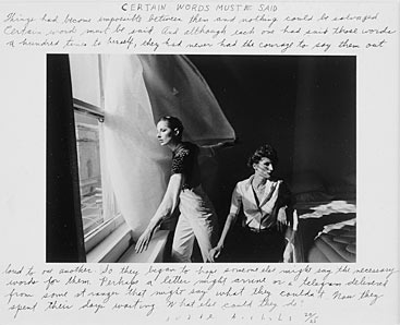 |
| Michals D (unknown) Certain Words Must be Said [online image]. Private collection. Available from www.shanelavalette.com/images/journal/ [Accessed 2 February 2013] |
 |
| Goldberg J (unknown) Untitled [online image]. Private collection. Available from /www.culturecritic.co.uk/_furniture/exhibitions/goldberg [Accessed 2 February 2013] |

The use of a simple image provides opportunity to add text on the image without losing the message.
Book covers frequently also use a combination of photographs with manipulation. An example is Stephen King's book Under the Dome where the cover designer has added a subtle reference to the title using a photogrpah with manipulation. The result is an interesting vibrant and captivating cover.
 |
| Under the Dome by Stephen King Art Director: Rex Bonomelli |
A simpler effect is this cover designed by John Fulbrook III. The image is directly relevant to the title, but evoking a sense of past as well.
 |
| At Swim Two Boys by Jamie O’Neill Designed by John Fulbrook III |
I was interested to find a cover of a poetry collection; the cover of Richard Hugo's Making it Certain It Goes On caught my eye. I like the subtlety of the wheatfield panning out into the distance; there is a feeling of certainty about the image as well as the sense of "going on". The cover of As It Is below is in a similar vein.
 |
| Making Certain It Goes On by Richard Hugo Designed by Darren Haggar |
Dynamic gallery
The website has a series of images with quotes from contributing poets as a moving banner. These are three examples, with the original image first:
 |
| Canon EOS 450D with EF24-105mm f/4L IS USM. f4; 1/60; ISO 200 focal length 105mm |

© Philip Lyons
The
first image was taken during a downpour in Kiev - the chair was
actually used by a self appointed taxi organiser who abandoned his post
once the rain came. The image was taken because the scene evokes a sense of abandonment. The words fit beautifully: the hope of the occupier of the chair has indeed been washed away.
 |
| Canon EOS 450D with 10-22mm f/4L IS USM. f4; 1/15; ISO 1600 focal length 22mm |

© Azadeh Kallili
The positioning of
the figure in the second image (taken in the tunnel on Bristol-Bath
cycle track) is key to matching the words in the extract from Azadeh
Kallili's poem. She is actually walking towards the photographer, but
this is indistinct - she could be walking away or stationary. But the
beauty of this conjunction is the ambiguity in the quote. Does the the
word "face" mean literally look towards the sun or is it used
colloquially in the sense that "I do not want to go out in the sun
today". There is ambiguity in the words and in the image.
This
image also demonstrates a technical point: that the positioning of
images on the website requires images in 2:1 dimensions rather than the
typical 3:2 or 4:3 from a SLR. Consequently the image has had to be
cropped at the bottom so the words can be placed on a clearly visible
part. In isolation the image would look wrong but in context it seems
not to matter simply because the addition of the words has effectively
created a new image.
(Tutor thinks that it is a shame to have cropped the image. I did made clear in the original blog that the cropping was a function of the need to fit in a particular space within poetry space website.)
 |
| Canon EOS 450D with EF24-105mm f/4L IS USM. f4.5; 1/60; ISO 400 focal length 24mm |

© Philip Lyons
The third example is less ambiguous but the words and the image of Westonbirt Arboretum fit perfectly - the sunlight through the trees with the autumn colours adding vibrance and interest and an inviting space in the middle foreground for the meeting suggested by the extract from Philip Lyons' poem. I took the image because of the light and colour; there is a sense of depth in the image. I di dno think of the foreground space being a meeting place, but this is a good example of where the combination of words and text add a dimension that the photogrpah alone does not necessarily evoke, in the mould of Dulas' work above.
Tutor feels this picture is too literal and lacking in hidden depth, and implies that this might not want this image on a final stage of the course. I disagree and see no reason to extract the image.
This selection provides examples of how words and images can enrich one another, a concept explored further with images and complete poems.
Illustration of poems
 |
| Canon EOS 450D with EF24-105mm f/4L IS USM. f6.7; 1/350; ISO 200 focal length 32mm |
This image of the sled beneath an oak tree on Cock Road Ridge in Kingswood is used to complement Moira Andrew's poem:
First Snow of Winter
We wake to a world bewitched,
a black and white negative
of itself. Hunchback gardens
crouch beneath a gun-grey sky
like a flock of gulls
huddled shoulder to shoulder
on some salty shoreline.
Feathered
trees thrust out
bare branches,
wide as wings,
across the bleak horizon.
Blackbirds balance on the
snow-sheathed fence, their
beaks ripping bright holes
in the colourless morning.
wide as wings,
across the bleak horizon.
Blackbirds balance on the
snow-sheathed fence, their
beaks ripping bright holes
in the colourless morning.
© Moira Andrew
Tutor would like to see some emotional response which I've added.
 |
| Canon EOS 450D with EF24-105mm f/4L IS USM. f4; 1/4; ISO 1600 focal length 105mm |
Cardboard City
Come visit my castle the next time you’re in the city?
Look, see. It’s not like the others, filth and mess.
They don’t fold up papers, conserve for other days
Living for the moment, whereas I think ahead
I’ve even made a window; it opens inwards and out
With that homely touch, I put a frill up.
I’ve got thick mattresses in all the bedrooms,
Lined with today’s newspapers, if you open up the window
With the light of the moon, you can read in bed.
A kitchen, with a basin for the sink
Of course I only use royal china, milk just two days out of date!
When the hard long day is over, of kerbs, park benches
Searching through bins, I get caught up in that evening rush.
I imagine the walls made out of granite, the roof slate
With chimneys keeping each room away from the damp
Gatehouse with its keeper, looking after my estate
So don’t forget, come to the city within a city,
Everything is manmade; you’ll see some amazing sites
You see I use to be an engineer.
© Johanna Boal
Tutor wonders why there is a strong colour cast on the crushed can image. It is not deliberate and is not designed to add to the meaning. The fact that the image was taken in tungsten lives is irrelevant to its use as an illustration of the poem.
 |
| Canon EOS 450D with EF24-105mm f/4L IS USM. f22; 1/125; ISO 200 focal length 55mm |
Susan Jane Sims was so inspired by the image of a solitary balloon stuck below the roof of Cabot Circus shopping centre that she wrote the following poem:
Windows
Of My Mind
When you
died
I thought
you'd float
beyond
the blue
and
though the pull
is strong
is strong
you never
quite
slip from view.
slip from view.
You're there,
pressed
against
the
windows of my mind
© Susan Jane Sims
Here the poet has added personalized feeling to what is almost an abstract image. I took the image because of contrasts: between the deep blue of the background and the pink of the ballon; between the quasi rectangular roof and the round balloon. But that is me as a photographer. I am intrigued by the poets's focus on the balloon only, she makes no observation of the geometry of the roof, yet photographically this is as important as the balloon. In image terms, the solitary point of the balloon contrasts with the geometrical pattern; they balance each other. The poet has focussed on the balloon only, thereby adding a different dimension for the reader.
Tutor says I have told us nothing about the taking of the image. I think there is a misunderstanding here: the whole point is that there is a two way dynamic between the imagery and the commentary on it by the poem. I have however added some notes as to what struck me originally.
Book covers
A few images of mine have been used for books of poems published by Poetry Space.
 |
| Canon EOS 450D with EF24-105mm f/4L IS USM. f4; 1/90; ISO 200 focal length 98mm |

© Poetry Space Ltd
(The image has had a black border applied for appearance on Amazon bookstore)
Philip Lyons' book is a collection of poetry written over several years; the title was the author's own - the publisher and I sought to illustrate with a simple image. This image (taken in Hyde Park) of a person engrossed in an activity that we can only conjecture at seemed to work well.
Tutor can see the image works well with the title of the book - the rough edges to the jeans and hat adding to a "sense of reality."
 |
| Canon EOS 450D with EF24-105mm f/4L IS USM. f8; 1/45; ISO 400 focal length 50mm |

© Poetry Space Ltd
(The image has had a black border applied for appearance on Amazon bookstore)
The concept for the cover of Words that Signify, an anthology of poems entered for a competition run by Poetry Space, arose from a street theatre experience that I saw, where the artist was drawing blind:

My view was that the image of the artist writing or drawing blind was not quite right for a book of poetry but the concept could be adapted to work better with the book title, consequently we have a thoughtful and intense expression from the chalk author, who has written two words on a brick wall. Are they random? What do they signify? These are the sorts of questions the image is trying to evoke as part of the cover.
Tutor asks "why these words?" A slight misconception here: the chalk author was not given a brief as to what to write and was never asked what "feather" and "hid" meant to him - that was the point of the title.
 |
| Canon EOS 450D with EF24-105mm f/4L IS USM. f13; 1/60; ISO 200 focal length 91mm |

© Poetry Space Ltd
(The image has had a black border applied for appearance on Amazon bookstore)
When asked to illustrate Through a Child's Eyes I suggested that we avoid a stereotypical WW2 type image - the 1940 sepia image of a boy and girl disembarking from a train in the middle of the English countryside, for example. It seemed appropriate to use a modern image and this image of a boy looking down from the John Hancock Center in Chicago works well.
The image as taken (above) was not suitable for a book cover - the title would be too easily lost in the background and the focus needed to be on the boy only, not on the object of his scrutiny. Consequently I used a high key black and white conversion in Silver Efex Pro2, thus almost eliminating the background, leaving just sufficient that we can see the boy is not a carefully selected and cut profile from another image. On a practical point, the conversion left sufficient white space for the title and author. The author herself was delighted by the image, immediately seeing the significance of it clearly being contemporary and multi cultural. It is important that our reflections of history acknowledge the view of today's audience and how it looks at the words of the past.
The question the tutor has asked is how I get from first image to second. Not quite sure what she means here - I have set out the photogpraphic process.
Conclusion
I have presented nine (the brief is between eight and twelve) of my images as used by Poetry Space. It is not only gratifying to see one's work being used in this way, but also it has challenged me to think about what works artistically for the audience and the client. It is photography in context - images being used to illustrate, and hopefully enhance, other people's work. Furthermore, we can see how the words enhance some of the images; the phrase on the tunnel image is a personal favourite, and I also particularly like the symbiosis of Words Of My Mind and the image of the balloon.
The Assignment has been a pleasure to do; the culmination of the course and a personal collection of images in practice. I have gained most from the People and Place module in my understanding of context and narrative. TAOP is concerned mainly about the technical aspects of single image photography; in this module we have begun to move towards photography serving a purpose, whether that be an artistic narrative or, as in this Assignment, a more commercial emphasis.
Sunday 27 January 2013
The Photograph as Contemporary Art: chapter 6
Moments in History
The chapter looks at how photography bears witness to the ways of life and events of the world.
In war photography, in particular, the emphasis has been on arriving after the decisive moment. An example is Sophie Ristelhueber, who has photographed the after effects of conflicts from Lebanon to Azerbaijan. ONce again, one has to query the significance of the imagery and the message that the photographer has tried to get over to her audience. Do images of war relics on a battlefield carry any special significance?
Paul Seawright was commissioned by Imperial War Museum to take images of the Afghanistan conflict. His image Valley is almost a copy of one of Fenton's images of Crimea War.
Deadpan photography is used often when artists photograph the human side of conflicts - the human side of the consequent disruption. Example is Fazal Sheikh's work in refugee camps. Uses black and white photography with extensive narrative to record the abuses against refugees.
Moving on from war, Cotton describes work of those who have access to disadvantaged communities, such as the work of Broomberg and Chanarin in penal systems. Deirdre O'Callaghan stayed in men's hostel in London for some time before photographing the residents and talking to them about their life histories.
Dinu Li cleverly photographed the personal effects of Chinese immigrants, not being able to photograph the individuals themselves.
Social documentary photography has taken many forms. An interesting variant is Paul Graham's work American Night in which the majority of the images are bleached out photographs of black Americans.
Martin Parr has used some unusual formats. Cotton uses his Common Sense to demonstrate the style. In this set, Parr takes multiple images of everyday items in beach resorts.
By complete contrast to this, Delahaye has commenced a long term project History, for which he takes panoramic images. Effective.
A sub genre of documentary photography is to show a reality that is distinct from the generally held preconceptions. Example is Mannikko's work looking at Finnish rural culture, based around Oulu.
Similar with Ballen's work in South Africa. He stages his subjects, more in the style of monochromatic art.
Mikhailov has photographed Ukraine in several guises as engineer photographer, photojournalist, and in contemporary art. In Case History one can legitimately ask whether the photography is voyeuristic rather than empathetic, although one cannot really tell when one stops and the other starts.
The Photograph as Contemporary Art: chapter 5
Intimate Life
In intimate photography, "the technical shortcomings of domestic non-art photography are employed as a language through which private experience is communicated to the viewer." Not sure I really believe that this is as deliberate as Cotton suggests; more likely that the technical quality of many of the images is questionable, and this argument is used as something of a justification.
Nan Goldin is most well-known intimate life photographer. She was a drug addict, had a traumatic childhood (her sister committed suicide at 18 when Goldin was 11), and had a destructive sexual relationship that together give her work authenticity.
Araki has taken thousands of sexually explicit images, publishing over 200 books.
Larry Clark was also part of the genre of photography as representation of sexually free society.
Fashion photography led to a spin-offs in art photography, notably Jurgen Teller's work, such as his images of go-see models.
Casual photography became vogue in 1990s with work such as Richard Billingham's photographic record of his chaotic and dysfunctional home life.
Other photographers have focussed on sequential family life, such as Annelies Strba, Ruth Erdt, and Elinor Carucci. Tina Barney and Larry Sultan have taken images of their rather better off families, Sultan with a mixture of posed and casual observations.
Like Tina Barney, Mitch Epstein took images of family life that "blend..photographically distant perspective with a subject that is intimately known." This is probably the key to successful images of family in an artistic sense: to use the knowledge the photographer has of his or her subjects to portray their characteristics, yet appear objective.
Subscribe to:
Posts (Atom)